

Kojie San
A bar of soap,
re-introduced.
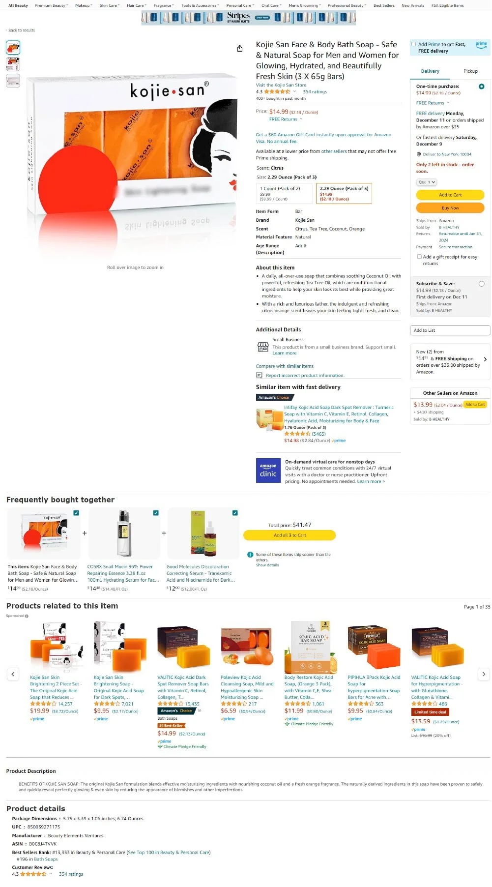
The listing did all its selling with a single packshot. We rebuilt the whole content experience — gallery, detail page and A+ Content — into one brand system.
3 → 7
Gallery Images
0 → A+
Full A+ Content Module
1 system
Gallery • page • A+
01 Overview
Kojie San is a heritage kojic-acid skincare brand. On Amazon, the listing leaned on a single product photo and generic copy — it showed the pack, but never the ingredients, the benefits, or the brand itself.
We were asked to rebuild the content end to end: main image gallery, product detail page and A+ Content — so the listing looked like the brand behind it and gave shoppers a reason to choose it over cheaper look-alikes.
02 The Challenge
A packshot doing a brand's job.
— One packshot carrying the whole listing — no lifestyle, no benefit — imagery, no proof.
— Copy that described the box, not the results or the active ingredients.
— No A+ Content — no space to tell the brand story or explain the ingredient science.
— Nothing to separate it from the cheaper look-alikes crowding the category.
Shoppers weren't rejecting the product. They were never given the case for it.
03 The Approach
Build the story, then the system.
Every asset was designed to move the shopper one step further — from what it is, to what it does, to why this brand.
01 — Map
Content architecture
Sequenced a gallery that leads with hero product, then ingredients, benefits, how-to and social proof.
02 — Story
Ingredient-led narrative
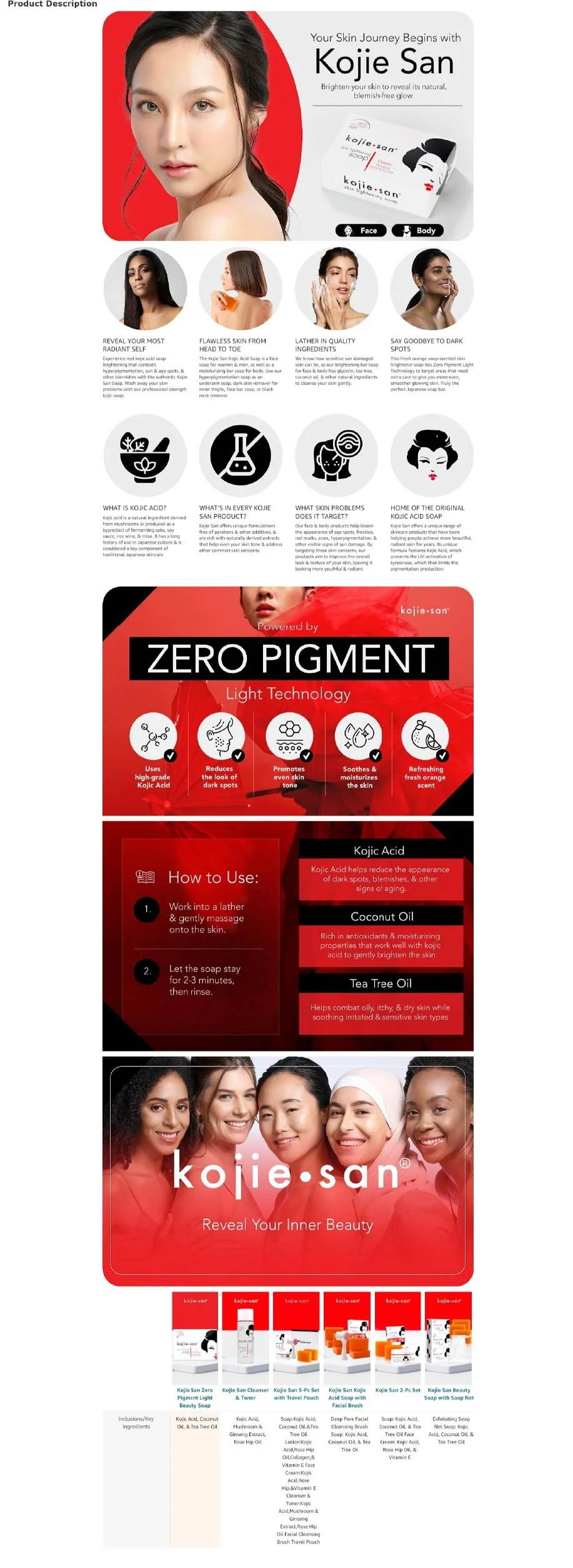
Built around kojic acid, coconut oil and tea tree — anchored by a "Zero Pigment / Light Technology" concept.
03 — Cast
Real, inclusive imagery
Replaced the stock feel with real skin and diverse models showing real, relatable results.
04 — Expand
A+ Content module
Created a full A+ page: brand story, ingredient science, how-to, range cross-sell and a comparison block.
05 — Unify
One visual system
Brought main images, detail page and A+ Content under a single design language — consistent head to toe, so the brand reads as one considered whole.
04 Before / After • Detail page
Same product. New presence.
— Before
— After
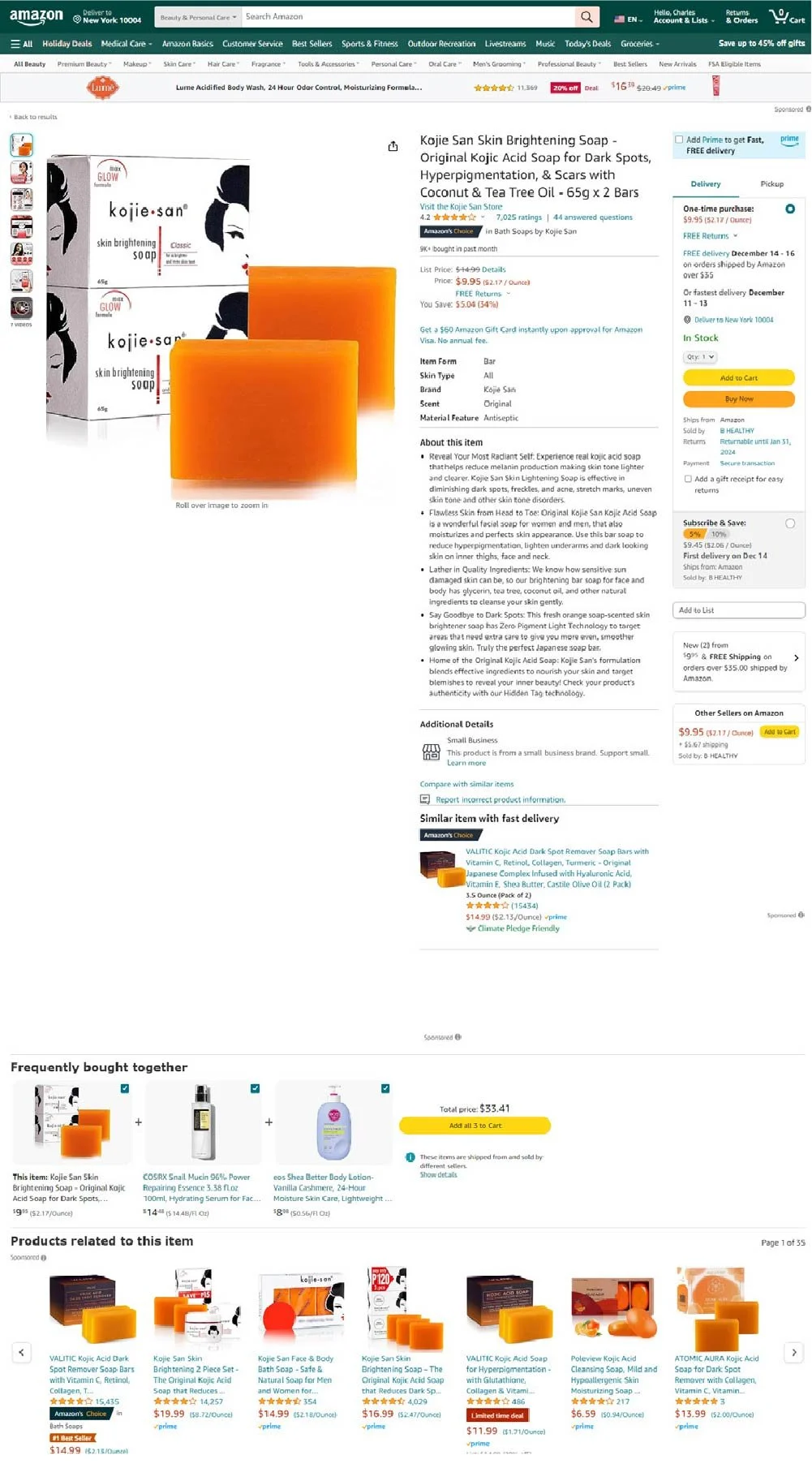
EXHIBIT A — Amazon product detail page, before and after. Representative sample of the full optimisation.
Exhibit B — A+ Content
05 The Result
A listing that looks like the brand.
Complete 7-image infographic gallery
Full A+ Content — built from nothing
Benefit-led detail-page copy
Ingredient science made legible
Authenticity cue — hidden-tag callout
A cohesive brand look vs generic sellers
The listing finally reflects the brand behind it — and gives shoppers a clear, confident reason to choose Kojie San over the cheapest bar on the shelf.